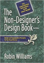
One of the best books on good design for beginners is Robin Williams’s The Non-Designer's Design Book. The most useful element of the book may be her "CRAP Principles" of good design, which can be summed up as follows:
Contrast
How you position items to guide the reader’s gaze around the page.
- Create a focal point around the most important item.
- Use a very large font for the most important thing.
- Organize items into logical and separate “chunks.”
- Remove superfluous or distracting information.
- Avoid the “wall of text” effect; instead, direct the eye.
- Use white space to contrast with your groupings.
Repetition
How you establish rules for the consistent display of related information.
- Your design should use the same fonts and formats, except when you are striving for contrast (when you want things different).
- Use consistent headings and subheadings with similar or parallel grammatical construction and visual formatting.
- If you use color, do so consistently according to a color scheme.
Alignment
How you use the visual lines of the page to direct the viewer’s gaze.
- Be consistent above all: same fonts, sizes, punctuation, etc.
- Items of the same class are lined up with each other.
- Indent to emphasize hierarchy and organization.
- Use centering or alignment to draw attention to text or images or to connect text to other elements in the design.
Proximity
How you group items to indicate relationships.
- Group similar items close together.
- “Chunk” your text by breaking it up into related groups.
- Place titles near to the information or images they describe.
- Cluster text with images to create visual unity.
- Avoid “orphans” – lonely titles or lines that get cut off from their kin.
Other considerations of good design:
Don't Cramp Your Layout
- Use white space generously and for contrast. To increase white space, decrease text: write as succinctly as possible!
- Keep paragraphs short. Use indents to distinguish elements.
- Use bullets and numbers wherever possible, but do not exceed the seven items of memory and maintain parallel form among items.
- Use numbering only when you have steps in a process or when items are ordered hierarchically.
- Pay attention to page balance when using graphics.
- Don’t go crazy with different fonts. Use at most two types of fonts in a document. Sans-serif (clean fonts ‘without tails,’ such as Arial used in stop signs) are best for large titles that can be "sight read," while serif fonts (with "tails," such as Times New Roman) are generally best for longer text that requires reading – unless you are going for a particular effect.
- Try to communicate as much as possible without the use of words.
- Make it easy for players to grasp the rules by just looking at the game board and related pieces. If possible, include a brief summary of rules (such as how the pieces move) on the board itself. Compare classic Stratego (below) to Stratego: Fire & Ice (above).
Write Titles and Subtitles That Communicate
- Use bold, enlarged, or capitalized titles to emphasize and establish hierarchy.
- Try to have fun with the design to communicate FUN!
- Use substantive headings – like “newspaper headlines.”
- Give your game a title and a tag line, e.g.: "Gotta catch 'em all!"


