Wednesday, December 1, 2010

Monday, September 27, 2010

Design Principles

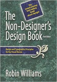
One of the best books on good design for beginners is Robin Williams’s The Non-Designer's Design Book.  The most useful element of the book may be her "CRAP Principles" of good design, which can be summed up as follows:

Contrast
How you position items to guide the reader’s gaze around the page.
  • Create a focal point around the most important item.
  • Use a very large font for the most important thing.
  • Organize items into logical and separate “chunks.”
  • Remove superfluous or distracting information.
  • Avoid the “wall of text” effect; instead, direct the eye.
  • Use white space to contrast with your groupings.
 The box design of Clue: The Office uses an enlarged image of Dwight for contrast, creating a sense of conflict and menace.


Repetition
How you establish rules for the consistent display of related information.
 
  • Your design should use the same fonts and formats, except when you are striving for contrast (when you want things different). 
  • Use consistent headings and subheadings with similar or parallel grammatical construction and visual formatting. 
  • If you use color, do so consistently according to a color scheme.
Battle Cry uses a repeated pattern of images to create an attractive border.

Alignment
How you use the visual lines of the page to direct the viewer’s gaze.

  • Be consistent above all: same fonts, sizes, punctuation, etc.   
  • Items of the same class are lined up with each other.   
  • Indent to emphasize hierarchy and organization.
  • Use centering or alignment to draw attention to text or images or to connect text to other elements in the design.
 The board design for Stratego: Ice vs Fire creates a great visual contrast of the two sides in red and blue.  Alignment is used to describe the pieces and their powers.


Proximity
How you group items to indicate relationships.
 
  • Group similar items close together. 
  • “Chunk” your text by breaking it up into related groups. 
  • Place titles near to the information or images they describe. 
  • Cluster text with images to create visual unity. 
  • Avoid “orphans” – lonely titles or lines that get cut off from their kin.
Tigris & Euphrates chunks visual images with text to help readers connect the rules to the pieces described.


Other considerations of good design:


Don't Cramp Your Layout
  • Use white space generously and for contrast.  To increase white space, decrease text: write as succinctly as possible!
 
  • Keep paragraphs short.  Use indents to distinguish elements.
 
  • Use bullets and numbers wherever possible, but do not exceed the seven items of memory and maintain parallel form among items.
 
  • Use numbering only when you have steps in a process or when items are ordered hierarchically. 
Maintain Design Coherence 

  • Pay attention to page balance when using graphics. 
  • Don’t go crazy with different fonts.  Use at most two types of fonts in a document.  Sans-serif (clean fonts ‘without tails,’ such as Arial used in stop signs) are best for large titles that can be "sight read," while serif fonts (with "tails," such as Times New Roman) are generally best for longer text that requires reading – unless you are going for a particular effect.

Make Your Design Usable
  • Try to communicate as much as possible without the use of words.
  •  Make it easy for players to grasp the rules by just looking at the game board and related pieces.  If possible, include a brief summary of rules (such as how the pieces move) on the board itself.  Compare classic Stratego (below) to Stratego: Fire & Ice (above).
Bad design: why not describe the powers of the pieces and any special rules about them?  The numbers are on the pieces themselves after all.  This is corrected in Stratego: Fire & Ice.


 Write Titles and Subtitles That Communicate
  • Use bold, enlarged, or capitalized titles to emphasize and establish hierarchy.
 
  • Try to have fun with the design to communicate FUN!
 
  • Use substantive headings – like “newspaper headlines.”
 
  • Give your game a title and a tag line, e.g.: "Gotta catch 'em all!"

Monday, September 13, 2010

Grid Game Ideas

As you work on two grid game ideas for our class on Wednesday, I hope you take some time to look around at similar games to help develop your ideas and to make sure you are not "reinventing the wheel" (or trampling on someone's copyrighted territory).  The best source of inspiration, after all, is other games, and you can sometimes use them as a launching pad for further exploration.


A great resource for finding sample games is Board Game Geek.  Interested in a zombie game?  Search "zombies" and track down games with that theme.  Most games include screen images of the board, game pieces, cards, etc., plus rules and general descriptions.  I used it to get ideas for a football-based grid game I played around with (see here and here) and I was amazed by how many football games there have been and how many different forms they have taken.

Remember: grid games can take many forms.  Don't be confined by the games you know -- try to learn about more games and ideas to expand your horizons.

Or just try to do something innovative by starting with a question, such as: "What would a grid game based on a hexagonal grid be like?"  It might get you to start thinking about bees or space ships.  And then you begin to get ideas.... 

Among the more interesting grid games developed in this class have been:
  • Zombie Mansion
    One player commands the Zombies and tries to keep the humans from escaping a mansion house.  As humans get bitten by the zombies, they join the zombie team and give the zombies more turns.  Surprisingly, the zombies usually lose.  Little zombie pieces, available for sale online, make this really fun.
  • Jungle Escape
    Be the first player to escape the jungle by making your way down a mountain to civilization.  Manage your resources and trade with the natives.  A race game with strategy.
  • Pizza Mania
    Shoot your game piece onto the wavy-cheese grid board to select a topping card.  You need to win four topping cards to win the game.
If you are stuck for ideas, get onto the web, look around, and see what is out there.  You are bound to come up with something.  Or take a pad and pencil and start drawing some shapes.  Whatever you do, just don't sit there.  You have to write up two one-page proposals, with a visual image, by Wednesday at 9:50.
Wednesday, February 10, 2010

Finding Game Pieces

There are lots of online sources for game pieces in this class, and I often tell people that finding the right pieces is one of the research challenges of the course.  To get you started, though, here are some places you might look:
Please let me know about other sources you found useful in the comments.

    Wednesday, January 27, 2010

    Making Your Grid Board Design

    There are a number of ways of making a grid board using Adobe Photoshop (or other tools), and almost as many tutorials as methods.  Ultimately, all of them return to the idea that you should begin by creating a square (or part-of-a-square) object to help you make a grid pattern.  I have annotated several links below.  You'll have to decide on the method that works best for you.

    After the list of tutorials on making grids, I have listed some Web 2.0 alternatives to Photoshop that students might want to try out for generating images for their game designs -- especially if you are working from home with no access to Photoshop.

    IMPORTANT: One word of advice: start by imagining how big you want the board and then calculating how big you want each square.  It will speed things up considerably and prevent you from having to do it over.  As carpenters always say: measure twice, cut once.

    • Creating a Grid with a Custom Pattern in Photoshop
      http://www.oman3d.com/tutorials/photoshop/video_grid/
      I liked this tutorial best, not only because it is in video form (which is easier than reading) but because I think the method it shows is probably the quickest and most effective and teaches you some interesting Photoshop skills -- especially in the use of strokes.  It also shows you one way of decorating the squares.

    • Grid Tutorial
      http://www.phong.com/tutorials/grid/
      This tutorial is focused on using a grid as a background for a header graphic (which might be useful to know for your box design), but the method it offers for making the grid is very simple.

    • How to Create a Grid Quickly and Effectively in Photoshop
      http://www.partdigital.com/tutorials/grid
      This one also offers a rather painless method in very few words.  It also shows you how you can use a picture as the background of your board.

    • Making Grid Masks in Photoshop
      http://www.graphic-design.com/Photoshop/Tips/grid.html
      This might be a good method if you want to use a picture as the background.

    • Photoshop Tutorials - Custom Grid
      http://www.cbtcafe.com/photoshop/newgrid/newgrid.html
      This is the method I discovered on my own for making a grid and it works.

    • Wavey Grid
      http://www.photoshopcafe.com/tutorials/wavey%20grid/wavey_grid.htm
      I threw this one in just in case someone likes the idea.  A few years back someone used this tutorial to make a pizza-box grid game where the wavey grid matched well with the cheesy pizza design.

    Alternatives to Photoshop

    Students often ask how they can edit images at home if they don't have Photoshop. I usually have recommended GIMP, which I have used with success and find quite intuitive (and similar to Photoshop in many ways). I have also seen books on using GIMP and I like some of its features. But I saw a great post recently that links to "Free Online Tools for Images and Graphic Design," which seems like the inevitable next step.  Here are some useful Web 2.0 graphic editing tools freely available on the web:

    Game Design (01:355:375:01)